Have you ever wanted to design a beautiful website but just didn’t know how? To be honest, a few years ago, that happened to me too. While browsing the web, I saw so many nice looking websites and wished I had the skills to create such designs. Today I can and I’m going to teach you how to do so too! Essentially, it requires a few Photoshop skills and an eye for detail. Through this tutorial, I will point out these tiny details which make a website design look beautiful. Fire up Photoshop and let’s get going!
Finished Website
Step 1 - Download the 960 Grid System Template
15 March, 2011
5 Top Web Design Trends: 2011 Annual Edition
2010 has been an incredibly verdant year for web designers. Mobile has hit the mainstream; Web typography has reached new levels of sophistication; New coding techniques have vastly improved our ability to get creative with design (without compromising stability). All in all, it’s been a year that’s moved fast, even by the standards of the web, so let’s dig in to our first annual post covering the state of web design as 2010 turns to 2011.
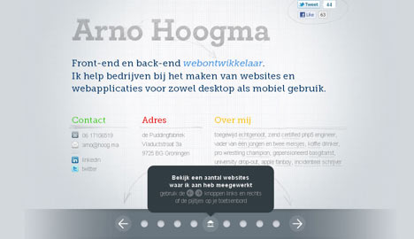
A Typographic Explosion
Alright, I guess you could make the claim that “typography will explode” each and every year… but 2010 has seen a few major changes to the underlying technology that actually make this claim legitimate. Primarily, the huge amount of growth of font-replacement technology over the last year and the mass adoption of “fonts as services” where third party companies host fonts (and licenses) that designers can use in live development environments. You could also say that designers are getting a lot more bold with typogrpahy as well… with more and more designs coming out lately that blur the line between print-4design and web design.
Let’s check out some examples (some using font replacement, others using other methods):
Web Design Trends : Web Typography 1
Web Design Trends : Web Typography 2
Web Design Trends : Web Typography 3
Web Design Trends : Web Typography 4
Web Design Trends : Web Typography 5
Web Design Trends : Web Typography 6
Web Design Trends : Web Typography 7
Web Design Trends : Web Typography 8
Web Design Trends : Web Typography 9
Web Design Trends : Web Typography 01
Web Design Trends : Web Typography 11
SubTrend: Print Design Inspired Sites
This was all the rage in 2009 – 2010, but the “print revolution” is alive and well on the web, and more and more sites are being designed to mimic great print designs, such as magazines, posters, fliers, and more.
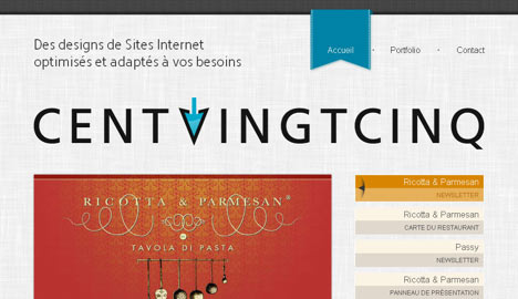
Grid Intensive Layouts
Grid layouts aren’t new to 2010 (or even 1980), but web designers are starting to break away from traditional web layouts (header, content column, sidebar, footer) in favor of more unique, grid driven layouts. What started out with the 960.gs movement has quickly spread to grid systems that can actually adapt to the viewers screen resolution.
Web Design Trends : Web Design Grid Layouts 1
Web Design Trends : Web Design Grid Layouts 2
Web Design Trends : Web Design Grid Layouts 3
Web Design Trends : Web Design Grid Layouts 4
Web Design Trends : Web Design Grid Layouts 5
Web Design Trends : Web Design Grid Layouts 6
Web Design Trends : Web Design Grid Layouts 7
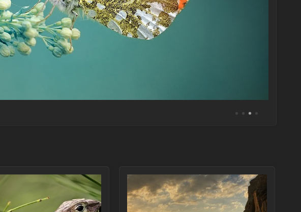
Massive Images
Here’s another trend that’s been happening for more than just this last year. Massive images were once taboo for web designers, but thanks to better image optimization, faster internet connections, and smarter loading methods, designers can gain a lot in some sites by pushing image sizes to the max.
More than just “big images”, we’re beginning to see more trending towards sites that use vast illustrative (and photographic) backdrops that are as a part of the actual experience as they are simply additional artwork.
Web Design Trends : Web Design Big Images 1
Web Design Trends : Web Design Big Images 2
Web Design Trends : Web Design Big Images 3
Web Design Trends : Web Design Big Images 4
Web Design Trends : Web Design Big Images 5
Web Design Trends : Web Design Big Images 6
Web Design Trends : Web Design Big Images 7
Web Design Trends : Web Design Big Images 8
Web Design Trends : Web Design Big Images 9
Web Design Trends : Web Design Big Images 10
Web Design Trends : Web Design Big Images 11
Texture, Texture, Texture
Textures aren’t new, but as each year passes we see it being integrated in new and interesting ways. 2010 saw a lot of the “subtle noise” texture, but more than anything, we’re beginning to enter a style phase where more designs are starting to feel “touchable”. This doesn’t necessarily mean that big, file-heavy textures are being used… instead, we’re seeing more subtle, well designed textures that repeat naturally.
Web Design Trends : Web Design Background Textures 1
Web Design Trends : Web Design Background Textures 2
Web Design Trends : Web Design Background Textures 3
Web Design Trends : Web Design Background Textures 4
Web Design Trends : Web Design Background Textures 5
Web Design Trends : Web Design Background Textures 6
Web Design Trends : Web Design Background Textures 7
Single Page Sites
Web Design Trends : Web Design One Page Designs
3D Environments
This is more of a novelty than a trend… 3D based sites are fun to use, but aren’t entirely accessible from some browsers and devices. That said, there are some fun new things happening in the way of three dimensional environments, so they’re worth checking out, even if you won’t be seeing them on your iPhone anytime soon ;)
Let the Discussion Begin!
Alright, so I’ve just hit the tip of the iceberg for all of the great trends happening in 2010, and I’ll be the first to admit that I’m sure I missed something. Post your comments, thoughts, trends, and anything else in the comments section and I’ll be taking any really great comments into account when it comes time to edit this post later on!
Happy 2011!
A Typographic Explosion
Alright, I guess you could make the claim that “typography will explode” each and every year… but 2010 has seen a few major changes to the underlying technology that actually make this claim legitimate. Primarily, the huge amount of growth of font-replacement technology over the last year and the mass adoption of “fonts as services” where third party companies host fonts (and licenses) that designers can use in live development environments. You could also say that designers are getting a lot more bold with typogrpahy as well… with more and more designs coming out lately that blur the line between print-4design and web design.
Let’s check out some examples (some using font replacement, others using other methods):
Web Design Trends : Web Typography 1
Web Design Trends : Web Typography 2
Web Design Trends : Web Typography 3
Web Design Trends : Web Typography 4
Web Design Trends : Web Typography 5
Web Design Trends : Web Typography 6
Web Design Trends : Web Typography 7
Web Design Trends : Web Typography 8
Web Design Trends : Web Typography 9
Web Design Trends : Web Typography 01
Web Design Trends : Web Typography 11
SubTrend: Print Design Inspired Sites
This was all the rage in 2009 – 2010, but the “print revolution” is alive and well on the web, and more and more sites are being designed to mimic great print designs, such as magazines, posters, fliers, and more.
Grid Intensive Layouts
Grid layouts aren’t new to 2010 (or even 1980), but web designers are starting to break away from traditional web layouts (header, content column, sidebar, footer) in favor of more unique, grid driven layouts. What started out with the 960.gs movement has quickly spread to grid systems that can actually adapt to the viewers screen resolution.
Web Design Trends : Web Design Grid Layouts 1
Web Design Trends : Web Design Grid Layouts 2
Web Design Trends : Web Design Grid Layouts 3
Web Design Trends : Web Design Grid Layouts 4
Web Design Trends : Web Design Grid Layouts 5
Web Design Trends : Web Design Grid Layouts 6
Web Design Trends : Web Design Grid Layouts 7
Massive Images
Here’s another trend that’s been happening for more than just this last year. Massive images were once taboo for web designers, but thanks to better image optimization, faster internet connections, and smarter loading methods, designers can gain a lot in some sites by pushing image sizes to the max.
More than just “big images”, we’re beginning to see more trending towards sites that use vast illustrative (and photographic) backdrops that are as a part of the actual experience as they are simply additional artwork.
Web Design Trends : Web Design Big Images 1
Web Design Trends : Web Design Big Images 2
Web Design Trends : Web Design Big Images 3
Web Design Trends : Web Design Big Images 4
Web Design Trends : Web Design Big Images 5
Web Design Trends : Web Design Big Images 6
Web Design Trends : Web Design Big Images 7
Web Design Trends : Web Design Big Images 8
Web Design Trends : Web Design Big Images 9
Web Design Trends : Web Design Big Images 10
Web Design Trends : Web Design Big Images 11
Texture, Texture, Texture
Textures aren’t new, but as each year passes we see it being integrated in new and interesting ways. 2010 saw a lot of the “subtle noise” texture, but more than anything, we’re beginning to enter a style phase where more designs are starting to feel “touchable”. This doesn’t necessarily mean that big, file-heavy textures are being used… instead, we’re seeing more subtle, well designed textures that repeat naturally.
Web Design Trends : Web Design Background Textures 1
Web Design Trends : Web Design Background Textures 2
Web Design Trends : Web Design Background Textures 3
Web Design Trends : Web Design Background Textures 4
Web Design Trends : Web Design Background Textures 5
Web Design Trends : Web Design Background Textures 6
Web Design Trends : Web Design Background Textures 7
Single Page Sites
Web Design Trends : Web Design One Page Designs
3D Environments
This is more of a novelty than a trend… 3D based sites are fun to use, but aren’t entirely accessible from some browsers and devices. That said, there are some fun new things happening in the way of three dimensional environments, so they’re worth checking out, even if you won’t be seeing them on your iPhone anytime soon ;)
Let the Discussion Begin!
Alright, so I’ve just hit the tip of the iceberg for all of the great trends happening in 2010, and I’ll be the first to admit that I’m sure I missed something. Post your comments, thoughts, trends, and anything else in the comments section and I’ll be taking any really great comments into account when it comes time to edit this post later on!
Happy 2011!
Creative and Inviting Food Advertisement Design Inspiration
Sometimes people choose to buying foods because isn’t taste, price or anything else. Some people including me sometimes buy a food because of these advertisement design, an unique creative and inviting food advertising design could make anyone who look at this ads interest to buy the products. There are a variety of way that food advertisements try to influence you, and food advertising is generally based around the factors mentioned previously. Here you’ll find a collection of brilliant and clever food ads that will be sure to make you look twice and admire the creativity. Download the advertisement design below:
Download Advertising Design
Download Advertising Design
The 960 Grid System
The premise of the system is ideally suited to rapid prototyping, but it would work equally well when integrated into a production environment. There are printable sketch sheets, design layouts, and a CSS file that have identical measurements.
12 March, 2011
Examination of Japanese Website Design Trends
Japan plays host to some very impressive website designers. Their skills in the arts cannot be compared and demonstrate a powerful digital force among Internet readers. Luckily understanding how to read Japanese isn’t required to admire their website graphics and animation effects.
We’ll be looking into a few Japanese website designs which have pushed the limits on conventional development. As a designer it’s a refreshing feeling to work with alternate design concepts and build your own unique ideas off these.
In fact, Flash offers so much extensible content you may be surprised at just what is possible. Motion backgrounds and animated menu effects are just the tipping point on many Adobe Flash powered websites. Intricate portfolio layouts and detailed characters almost spring to life off the webpage.
One overlooked misconception is the loading speed of each page. Because the entire website is Flash-based it will require a large amount of bandwidth to transfer and download all of the page content. This frequently leads to very long loading/splash pages which are a huge loss for potential user experience.
Although in the end it’s difficult to provide any judgement on the Flash-based approach. There are also many Japanese websites which are built off HTML5/CSS3 so I’m not categorizing all layouts as Flash-based. However with such a wide range of out-of-box thinking Japan has shown us a new outlook on envisioning the modern day website design.

In many new-age web designs we are seeing much more illustrated artwork and digital graphics. Icon designers have also integrated an enormous amount of hand-drawn effects into their works. Japanese website designs have become much more branded by the likes of mascots, illustrated vectors, and small page icons.
Similarly artists who offer these graphics showcase their work on many places throughout the web. Twitter backgrounds and Deviant Art accounts are full of some amazing illustrations from past designs.
Many of the websites coming to mind include innovative virtual worlds from video games. Katamari Damacy and Kingdom Hearts II specifically stand out as offering a very powerful user interface presence. The striking similarity between menu links in-game and on the webpages are resounding.
This can be seen not only for these games, but countless other series. The most common approach of course is an entire Flash-based website constructed through ActionScript events. Even so, other Japanese graphics artists are creating unique UI effects outside of just the video game industry.
These include shots of arial birds-eye-view photos from cities and taller buildings. Many times the background or Flash animation on a page will include common everyday natural elements such as cats, trees, cars, and entire human cities. There are neat user effects applied to create a natural mood (e.g. website colors changing from day to night).
These graphics of buildings and people can sometimes even be built into the website itself. The varied degree of creativity from Japan shows even entire websites using a small land mass as navigation for the entire website. Pages can be accessed via buildings, lawn signs, even blimps flying atop the page heading!
The designs are from a selection of varied topics and niches from a handful of time periods. If you have other suggestions for similar websites feel free to share them in the comments below.


We’ll be looking into a few Japanese website designs which have pushed the limits on conventional development. As a designer it’s a refreshing feeling to work with alternate design concepts and build your own unique ideas off these.
The Rise in Flash
Many of the most popular Japanese websites have been built in Flash, and this is no surprise. Although Flash-based websites do not rank very well in Google (at all) they offer a unique user experience which can’t be found anywhere else.In fact, Flash offers so much extensible content you may be surprised at just what is possible. Motion backgrounds and animated menu effects are just the tipping point on many Adobe Flash powered websites. Intricate portfolio layouts and detailed characters almost spring to life off the webpage.
One overlooked misconception is the loading speed of each page. Because the entire website is Flash-based it will require a large amount of bandwidth to transfer and download all of the page content. This frequently leads to very long loading/splash pages which are a huge loss for potential user experience.
Although in the end it’s difficult to provide any judgement on the Flash-based approach. There are also many Japanese websites which are built off HTML5/CSS3 so I’m not categorizing all layouts as Flash-based. However with such a wide range of out-of-box thinking Japan has shown us a new outlook on envisioning the modern day website design.
Animation Ignition
It seems the Japanese community is well renowned for their work in the digital animation arts. Ranging from television to video games it seems the artistic works meld into the islands’ society and culture.In many new-age web designs we are seeing much more illustrated artwork and digital graphics. Icon designers have also integrated an enormous amount of hand-drawn effects into their works. Japanese website designs have become much more branded by the likes of mascots, illustrated vectors, and small page icons.
Similarly artists who offer these graphics showcase their work on many places throughout the web. Twitter backgrounds and Deviant Art accounts are full of some amazing illustrations from past designs.
Custom UI Pattern
This is a common trend amongst web designers and has been growing rapidly. Many Japanese companies which involve their products in the entertainment sector have gone above and beyond to create a dynamic user interface to match their website.Many of the websites coming to mind include innovative virtual worlds from video games. Katamari Damacy and Kingdom Hearts II specifically stand out as offering a very powerful user interface presence. The striking similarity between menu links in-game and on the webpages are resounding.
This can be seen not only for these games, but countless other series. The most common approach of course is an entire Flash-based website constructed through ActionScript events. Even so, other Japanese graphics artists are creating unique UI effects outside of just the video game industry.
Elements of Physical Reality
It’s not too often we’ll see images of physical reality built into the most popular websites of today. This is quite the contrary of many popular Japanese artists which in fact specialize in building outstanding modern-day layouts.These include shots of arial birds-eye-view photos from cities and taller buildings. Many times the background or Flash animation on a page will include common everyday natural elements such as cats, trees, cars, and entire human cities. There are neat user effects applied to create a natural mood (e.g. website colors changing from day to night).
These graphics of buildings and people can sometimes even be built into the website itself. The varied degree of creativity from Japan shows even entire websites using a small land mass as navigation for the entire website. Pages can be accessed via buildings, lawn signs, even blimps flying atop the page heading!
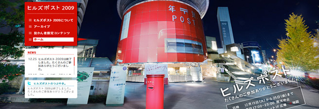
Web Gallery Showcase
Below is a small collection of Japanese website designs. These include mostly Flash pages with animation effects and custom UI elements. If you’re looking for design inspiration this may be one of the most creative and “out-there” galleries.The designs are from a selection of varied topics and niches from a handful of time periods. If you have other suggestions for similar websites feel free to share them in the comments below.
Nestle
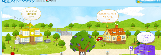
Eye Talk Town
Egao Saku
Hiroto Rakusho
Love Happy
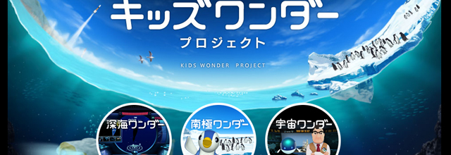
kids wonder project
Naruhodo Agent
10 March, 2011
HTML5 & CSS3: Take Your Design to Another Level
While both languages for HTML5 and CSS3 aren’t fully complete yet, taking the time time to familiarize yourself with some of the pointers in this post can really help you achieve that clean look and feel for your site. Let’s take a deeper look at them.

Steve Jobs famously refuses to allow Flash on the iOS due to the many bugs and crashes it experiences, therefore, learning how to use the more intricate features of HTML5 is going to be a must for those who want to develop apps and iOS-friendly websites. With Google rolling out an HTML5-friendly version of YouTube, many developers are starting to see how important this system will become in the near future. However, with Firefox resisting some of the advent of HTML5, developers and designers are still feeling the need to cover all of their bases when implementing new features on a website.
The idea behind HTML5 is that it’s not one large entity, but rather made up of smaller parts that work together to create something innovative and advanced. Each browser may support different features of HTML5, which makes it important for those interested in coding to figure out which features they need and which will be supported by different browsers.
HTML5 simply builds upon the widespread success of HTML4. That means a coder doesn’t have to throw away the existing markup, but rather build upon and improve the old one. For example, forms can be updated to allow for new features such as a better email input for those using a mobile device. However, viewers stuck in IE6 will simply see it as a text field and still be able to use it.
Here are some examples of HTML5 in use:

One drawback to using CSS is the requirement to implement filters to change how something will appear onscreen using different browsers. Although Internet Explorer is known for bugs, CSS can still be incorrectly interpreted by Firefox or Chrome. As such, some web designers have created different CSS codes to be sent to different browsers, or use filters to cut off CSS delivery completely.
CSS3 offers some exciting new features to enhance the appearance of a website. Although these features might not be absolutely necessary to the functionality of a website, users are coming to expect a website to look awesome as well as operate cleanly. CSS3 makes it easier for designs that will make visitors “ooh and aah” over them to be implemented.
Some features, such as menus, are necessary in almost any website. But with CSS3, the functionality and aesthetic appeal increases exponentially. Submenus upon hovering, horizontal menus, menus with rounded edges, submenus with tabs, submenus with descriptions, and menus with submenus with rounded edges with descriptions on hover are now all possible with some tweaking. Users will appreciate the ability to see a little more of what that page is about before potentially wasting loading time.
Text shadows – Sounds exactly like what it is: provide a drop shadow underneath HTML text elements.

Multiple backgrounds – Overlaying multiple backgrounds to a page is possible with this code:
Opacity levels – Before, you had to create a new image or use a CSS filter. Now, simply input “opacity: 0.5;” or another desired number to get the effect.
RGBA coloring – Rather than using hex colors and memorizing them or referring to a cheat sheet, this technique allows you to choose the amount of red, green, blue and opacity in your design and doesn’t require any browser extensions.
Transform – This code allows you to choose how big you want an area to become during hover.
Rounded corners – Prior to CSS3, these used to be tricky, but now you can get rid of those sharp corners without using images..
Resizing elements – This code works in Safari to provide a small resizing triangle that allows users to…resize.
 Brian Flores is a SEO and copywriter for InMotion Hosting, one of the top dedicated server providers in the country. He regularly posts useful tutorials on WebHostingHelpGuy. You can follow him on Twitter @WHHG_InMotion or @BrianAFlores.
Source: http://webdesignledger.com
HTML5
HTML5 is the latest version of HTML or Hypertext Markup Language. It is currently only fully supported by a handful of browsers but the next year should see a large increase in usage. It isn’t expected to be completed until 2014, but the features that are available now are a great way to become acquainted with HTML5 and add some cool elements to your website.Steve Jobs famously refuses to allow Flash on the iOS due to the many bugs and crashes it experiences, therefore, learning how to use the more intricate features of HTML5 is going to be a must for those who want to develop apps and iOS-friendly websites. With Google rolling out an HTML5-friendly version of YouTube, many developers are starting to see how important this system will become in the near future. However, with Firefox resisting some of the advent of HTML5, developers and designers are still feeling the need to cover all of their bases when implementing new features on a website.
The idea behind HTML5 is that it’s not one large entity, but rather made up of smaller parts that work together to create something innovative and advanced. Each browser may support different features of HTML5, which makes it important for those interested in coding to figure out which features they need and which will be supported by different browsers.
HTML5 simply builds upon the widespread success of HTML4. That means a coder doesn’t have to throw away the existing markup, but rather build upon and improve the old one. For example, forms can be updated to allow for new features such as a better email input for those using a mobile device. However, viewers stuck in IE6 will simply see it as a text field and still be able to use it.
Here are some examples of HTML5 in use:
Features
- Any HTML5 syntax requires a doctype to be specified so that the browser can render the page in standards mode. The good news though is that the doctype declaration has also been simplified from previous HTML. It is now just:
- The audio and visual support in HTML5 is outstanding. As soon as it’s fully running and all browsers support HTML5, you will find it easy to add audio and video to websites without the need for outside plugins.
- Editing the content of your website is simplified with HTML5. Using the contenteditable attribute, you can quickly and painlessly change your text by adding contenteditable=“true” to any element.
- The canvas element makes it possible for you to bypass Photoshop to make your 2D images and directly place them in your code.
- The application cache enables you to navigate web applications while you are offline.
Why Use It
- HTML5 will load much quicker than its older brother because it implements WebSockets.
- Mobile phone applications will be much more accessible if written in HTML5 because you will not have to write applications for a specific brand of phone but rather can create universal applications for all phones.
- You have more flexibility in creating your website.
- Video, audio and images are all easily written right into the code, eliminating the need for any third party software.
- This language is growing and will only result in more, new, better and faster features that will leave old websites looking outdated.
- HTML5 simply builds on HTML4, so the old markup can stay in place as you develop the new features.
- HTML5 and CSS3 together will give you some serious designer credibility.
CSS 3
Cascading Style Sheets (CSS) offer increased flexibility in the presentation of website content. In essence, it just makes everything prettier. Although CSS3 isn’t supported by all browsers yet, it’s becoming increasingly popular because it makes these changes so much easier than trying to get the same effect using something like a Javascript plugin or creating slightly different versions of the exact same image.One drawback to using CSS is the requirement to implement filters to change how something will appear onscreen using different browsers. Although Internet Explorer is known for bugs, CSS can still be incorrectly interpreted by Firefox or Chrome. As such, some web designers have created different CSS codes to be sent to different browsers, or use filters to cut off CSS delivery completely.
CSS3 offers some exciting new features to enhance the appearance of a website. Although these features might not be absolutely necessary to the functionality of a website, users are coming to expect a website to look awesome as well as operate cleanly. CSS3 makes it easier for designs that will make visitors “ooh and aah” over them to be implemented.
Some features, such as menus, are necessary in almost any website. But with CSS3, the functionality and aesthetic appeal increases exponentially. Submenus upon hovering, horizontal menus, menus with rounded edges, submenus with tabs, submenus with descriptions, and menus with submenus with rounded edges with descriptions on hover are now all possible with some tweaking. Users will appreciate the ability to see a little more of what that page is about before potentially wasting loading time.
Cool New Tricks
Box-shadows – This could allow the main content to slide beneath another area, such as a footer, or cause the area to look as if it’s coming out of or sinking into the website. CSS3 makes this happen without requiring the coder to create a new image or use a Javascript plugin. Another technique is to cause the shadow to appear upon hover.Text shadows – Sounds exactly like what it is: provide a drop shadow underneath HTML text elements.
h1 {
     text-shadow: 0px 1px 1px rgba(0,0,0,.2);
}
Easier font additions – To add a new font, simply upload the file to your server, link to the CSS file and create a font family.Multiple backgrounds – Overlaying multiple backgrounds to a page is possible with this code:
body {
     background:
     url(../images/bottom-left.png) top right fixed no-repeat,
     url(../images/bottom-right.png) top left fixed no-repeat,
     url(../images/top-left.png) bottom left fixed no-repeat,
     url(../images/top-right.png) bottom right fixed no-repeat;
     background-color:#ffffff;
}
Border images – Rather than simply using a stodgy old plain border, CSS3 allows you to upload an image to use as a border.Opacity levels – Before, you had to create a new image or use a CSS filter. Now, simply input “opacity: 0.5;” or another desired number to get the effect.
RGBA coloring – Rather than using hex colors and memorizing them or referring to a cheat sheet, this technique allows you to choose the amount of red, green, blue and opacity in your design and doesn’t require any browser extensions.
Transform – This code allows you to choose how big you want an area to become during hover.
Rounded corners – Prior to CSS3, these used to be tricky, but now you can get rid of those sharp corners without using images..
div {
     border: 2px solid #434343;
     padding: 10px;
     background: #e3e3e3;
     -moz-border-radius: 10px;
     -webkit-border-radius: 10px;
     width: 500px;
}
Note: Moz stands for Mozilla, while webkit is for Safari and Chrome.Resizing elements – This code works in Safari to provide a small resizing triangle that allows users to…resize.
div {
     resize: both;
}
About the Author
Brian Flores is a SEO and copywriter for InMotion Hosting, one of the top dedicated server providers in the country. He regularly posts useful tutorials on WebHostingHelpGuy. You can follow him on Twitter @WHHG_InMotion or @BrianAFlores.Source: http://webdesignledger.com
Slideshows
Slideshows are becoming increasingly popular these days and can add great functionality to your website. There are a huge variety of plugins available on the internet, some are as easy as inserting a few images into an unordered list whilst others have a range of possible functions to enhance your site.
If used right you give off a great visual impact to your viewers, here are a few site’s that use slideshows to their advantage:


If used right you give off a great visual impact to your viewers, here are a few site’s that use slideshows to their advantage:
demo.duotive.com/duotive-two
apple.com
puppetbrain.com
launchmind.com
agnarson.com
boerdam.nl
marcsdesign.com
estebanmunoz.com
foxtie.com
Large Background Images
This isn’t really a new trend, it’s been going on for a while, but with latest technology and a lot more usage of CDN Servers and Caching Tools having Large Background Images is a lot less con-traversal than it used to be. The great thing with Large Image Backgrounds is that it automatically grabs your visitors attention and can have a huge impact if it’s relative to your target audience.
Overall it can give a great user experience if executed well.


Overall it can give a great user experience if executed well.
august.com.au
creativespaces.net.au
carfreaks.net
cpeople.ru
thomasbrun.no
nespresso.com/variations
The power of CSS3

The new W3C CSS3 icon
You shouldn’t ‘not’ try to keep your website current just because 1 browser doesn’t meet the standards you need, remember website’s are always improving as well as the mark-up for it, don’t take the safe route and not bother else you may lose out in business to other competition. Remember, first impressions count for a lot.
Liquid Layouts
Web design has come along way over the years along with screen resolutions. As it’s evolved you can no longer just expect people to be using the typical 1024*768 screen resolution. Screen’s nowadays come in all shapes and sizes some people even use HDTV’s, why not make use of some of that potential extra space you have and adapt your site to sustain larger and smaller resolutions for a better user experience? It is 2011 remember technology is far superior to how it was 5 years ago.
 Not only do you have to consider screen resolution but also aspect ratio, take the iPhone or iPad Touch for example, they have the ability to flip your site in an instant. Take our site for example, if your screen resolution is bigger than 1200px wide the sidebar will be double the width otherwise it will fall-back to a suitable size for a 1024px width resolution. Give it a go, change the browser width and see it change.
There are many popular site’s that do this already so there’s no reason why you shouldn’t support multiple resolutions, after all if you have the ability to use more space why not use it?
Source: http://thefinishedbox.com
There are many popular site’s that do this already so there’s no reason why you shouldn’t support multiple resolutions, after all if you have the ability to use more space why not use it?
Source: http://thefinishedbox.com
Web Design Trends 2011
HTML5 and CSS3
You can’t talk about website design trends for 2011 without mentioning HTML5 and CSS3. As with most versions of HTML, the latest version tends to take over slowly, but eventually you’ll be hard pressed to find older styles. Both HTML5 and CSS3 make websites easier to build and link with social tools. In order to stay marketable as a designer, it is essential to understand how these systems work and use them appropriately.

 There is no Flash on those websites. Flash was, and still is, in a way, fruit from the forbidden tree. While almost anything could be done with Flash, design-wise, compatibility issues and interference with search engine optimization still plague it. HTML5 offers some of the same design tools and functionality of Flash, without those problems, and that is why you’ll be seeing more of it in 2011.
Older typography programs allowed you to use more fonts in your html, but none of them were SEO friendly. With HTML5, CSS3, and new typography programs, there are now many fonts available that do not slow down search engine optimization. For example, Typekit now provides designers with options that are both attractive and SEO compatible. More print style typography will start to become mainstream in 2011 and it will even start to crop up on e-commerce sites.

 In addition to making wider sites to accommodate larger monitors, website designers will also be focusing on smaller, mobile versions of their websites. People are getting more comfortable shopping on their phones, and mobile ecommerce transactions are on the rise. Ecommerce websites will increasingly have mobile versions available, either as an app, or as an alternate, small screen friendly site.

 For a FREE WEBSITE DESIGN CONSULTATION, Contact Active Web Group TODAY!


For a FREE WEBSITE DESIGN CONSULTATION, Contact Active Web Group TODAY!


You’ve probably already seen these barcodes in commercials, advertising and magazines. Just take a picture with your smartphone and a website appears! These codes can be used in many ways, in many places, and over the next year will start to become a lot more common. You can use Kaywa to generate a QR code for your website!
We here at Active Web Group believe that these Web designs will be the major trends in Website design for 2011. For more information contact Active Web Group today for a free consultation or let us redesign your current Website with a custom-designed Website for your online presence.
Source: http://www.activewebgroup.com/
You can’t talk about website design trends for 2011 without mentioning HTML5 and CSS3. As with most versions of HTML, the latest version tends to take over slowly, but eventually you’ll be hard pressed to find older styles. Both HTML5 and CSS3 make websites easier to build and link with social tools. In order to stay marketable as a designer, it is essential to understand how these systems work and use them appropriately.
Typography
Part of the appeal of HTML5 and CSS3 is the typography offered with them. Website design had always been somewhat limited in terms of typography. You could always use any font you wanted, as long as you rasterized it and placed it as a static image. Obviously, doing that hurts search engine optimization, and also limits the functionality of that type. Typefolly.com has a nice example of what can be done with type in HTML5.Older typography programs allowed you to use more fonts in your html, but none of them were SEO friendly. With HTML5, CSS3, and new typography programs, there are now many fonts available that do not slow down search engine optimization. For example, Typekit now provides designers with options that are both attractive and SEO compatible. More print style typography will start to become mainstream in 2011 and it will even start to crop up on e-commerce sites.
Bigger and Smaller
High resolution, widescreen desktop monitors are now very affordable, and website designers will be taking advantage of that space. For many years designers had been using the Grid 960 system to optimize their design dimensions. It was based on 1024×768 pixels, which was the average monitor resolution just a few years ago. On activewebgroup.com, only 21% of visitors last month had a screen resolution narrower than 1024. Grid 1140 was created to adjust to this increase in average size. Expect to see most new grid designs for 2011 using this wider format.Headers
With wider designs naturally come wider headers. Since a header is the first impression a customer gets of the website, more companies will be making better use of that space. Large and interactive headers with special offers, promotions, and calls to action help increase the number of conversions a website creates. ProfessionalEquipment.com has a good example of this.Depth
For 2011 creating a sense of dimension and depth will become more common. 3D movies and televisions started to get some traction in 2010, and web designers will be looking to capitalize on that trend for 2011. While true 3D is still just a pipe dream for web designers, the technologies currently available can be used to create a very realistic sense of depth. HTML5, JavaScript, and even Flash combine for some interesting 3D effects. Rowtothepole.com uses parallax scrolling to give their website a sense of depth, and this Michael Jordan inspired site shows a clever use of pop-up book style graphics to create a 3D effect.Touchscreen
With smartphones, tablets, and even some desktops using touchscreens, designers need to accommodate fingertip navigation. Links that change color, or underline when a mouse is hovered over them will not have the same effect on a touchscreen. Leave plenty of space for a finger to click a link or your website will be unusable on a touch screen device.Big Image
While big images aren’t new, wider screen sizes offer a bigger window with which to display them. More sites will be using that space for great big images in 2011. Here are a few examples:Single Page
Along with touchscreens, smartphone apps, and more focus on accommodating varying screen sizes, you’ll be seeing more single page sites, with clear influences from applications and user interfaces in 2011. Interaction is key, and more user friendly websites will start to crop up.For a FREE WEBSITE DESIGN CONSULTATION, Contact Active Web Group TODAY!
Quick Response
You’ve probably already seen these barcodes in commercials, advertising and magazines. Just take a picture with your smartphone and a website appears! These codes can be used in many ways, in many places, and over the next year will start to become a lot more common. You can use Kaywa to generate a QR code for your website!
We here at Active Web Group believe that these Web designs will be the major trends in Website design for 2011. For more information contact Active Web Group today for a free consultation or let us redesign your current Website with a custom-designed Website for your online presence.
Source: http://www.activewebgroup.com/
Subscribe to:
Posts (Atom)