Infographics are popular. They help reduce complex coherences to
simplified illustrations. Information gets visualized. The best
infographics are self-explanatory, needing almost no text at all. A
picture is worth a thousand words, they say. And it’s true. In this
collection, we share with you 40 entertaining infographics on popular
topics from around the net. If you are a programmer, illustrator,
designer or nerd of any other type, you’ll most likely find at least the
majority of these informative pieces interesting. If you don’t like the
content, probably you’ll be inspired by the way, the graphic has been
done.
 If you are keen on creating your own infographic, we have
something for you: Look for our mini-tutorials on photoshopping your
information throughout the following article.
If you are keen on creating your own infographic, we have
something for you: Look for our mini-tutorials on photoshopping your
information throughout the following article.
Topic: History of programming languages

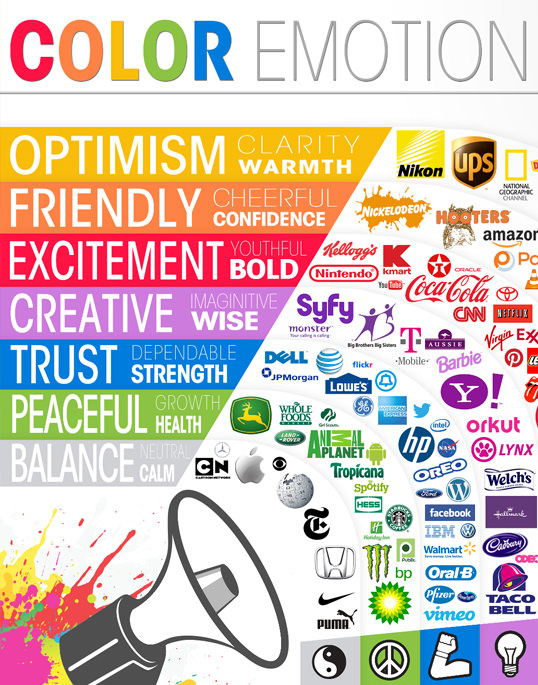
Topic: Impact of colors
Topic: Protecting your brand

Topic: History of the iPhone

Recent infographic do not impress with hard facts, at least not foremost. They do impress through their way of presenting these facts. To help you start with your own visualizations, I have put together a few mini-tutorials using my favorite platform, Adobe Photoshop. With a good ability of abstraction you should be able to port my tipps to your own favorite graphics app, too.
To show percentages in the form of some bars, we might choose to use a light 3D appearance . We pick the Rectangle Tool and draw a short bar in the color of our choice.

02 Second Bar
Ctrl+J duplicates the bar. With the help of the Move Tool we position the second instance of our bar slightly down and to the right. BBoth bars should overlap a little. Performing a double-click on the thumbnail of the layer in the layers window, we open the color picker to choose a slightly lighter tone of the same color. Pick up the Direct Selection Tool, target the right edges and pull them over to the right.

03 Designing The Transition
With another Ctrl+J we duplicate the bar again. This time, still using the Direct Selection Tool we position the upper right edge of this bar on the upper right edge of our first bar. The lower right edge is handled in the same way. Now we darken the new bar to give it a darker appearance than the other two bars show. Change the layer order, so that the smaller, darker bar is in between the two bigger bars.

04 Reproduction And Labeling
Now we can easily duplicate the three pieces, position them elsewhere and color them differently as often as we need percentage bars to be shown. If you need shorter and/or longer bars you can always take to the Direct Selection Tool and pull the edges. Label the bars simply by putting in text at appropriate positions.

Topic: Evolution of the – well – Geek

Topic: Stand up to not get killed by your own chair

Topic: Benefits of natural environments for animals

Topic: SEO, obviously…

Topic: Electronic waste

To quickly enhance an infographic, read-made illustrations by stock agencies are a valid choice. Mostly these come as vector graphics, which guarantees for unlimited scalability. Image we’d want to play around the topic “Pets in Households by Species” we would, besides other things, need some illustrations of the pets involved. I found this one: Origami animals logo templates | #89604826 | sellingpix from Shutterstock.com.
While the graphic does not come with a transparent background, we double-click the image to create a Layer 0. Now we choose Add Layer Mask from the bottom of the layers window. Now, with the help of the Pencil Tool and black as the foreground color we knock out the illustration roughly, then finer with the Polygonal Lasso Tool.

02 Add Illustrations
If you’ve put the illustrations on separate layers, we can easily combine them with the above created percentage bars. Having worked with shapes we can as easily adjust colors. We have successfully enhanced this part of the infographic, but we want more…

Topic: What is watched on YouTube?

Topic: Mobile clients need mobile websites

Topic: Awe, look. A beautiful HTML code…

Topic: Whose one is longer?

Topic: Why visitors leave you early

Topic: CSS Facts

Topic: Title says it all

Topic: How easy it is to get a job in social media

Topic: Ever wondered, what IT people really do?

Topic: Online Marketing

Topic: Online Testing

Topic: Effective Webdesign

Topic: The future is upon us

Topic: Is there such a thing as a perfect landing page?
 .jpg
.jpg
Topic: How Facebook changes relationships

Topic: Exactly,… Awesome.

Topic: Apple’s history

Define a foreground color and draw a shape using the Ellipse Tool while keeping the Shift key pressed. This way your ellipse will become a perfect circle. Legs are created using the Rounded Rectangle Tool. In the options bar define a radius of 20 pixels.
To draw the female icon you can copy the shapes of the male icon (biblical, isn’t it), position them with the use of the Move Tool and then adjust the colors by double-clicking the layer thumb. The skirt got drawn with the Pencil Tool, with shape selected in the options bar.

02 Bodies
Create the body of the male icon with the Rectangle Tool. Draw the shoulders using the Rounded Rectangle Tool. To make sure, they are only shown in half, you pick the Rectangle Tool and select Subtract from shape area in the options bar. Now we can selectively set areas of the shape to transparent, simply by drawing another form on top of them. Arms and legs are crafted using the Rounded Rectangle Tool.

03 Percentage Values
Position the arms of the woman icon using Edit > Transform Path > Rotate. Draw the bars for the percentage values using the Rectangle Tool and inscribe the values with the Text Tool. I’d suggest white for the values.

Topic: Who are those Flickrers?

Topic: Typical Twitter users

Topic: Storage, I say

Topic: Our attention pyramid

Topic: … are beautiful

Topic: The year of social media in a book

Topic: Does your web design talk bad about you?

Topic: From the teacher’s bookmarks

Topic: Affiliate Marketing

Topic: What’s the difference between developer and designer?

Topic: Bounce off your visitors with large images and such

Topic: Gaming and dating both end on ing

Topic: If you need advice on this…

Topic: Type properties

Source : http://www.noupe.com/photoshop/40-entertaining-infographics-plus-some-tips-on-creating-your-own-using-photoshop-75153.html
Designing The “World Of Programming” Infographic
Website: smashingmagazine.comTopic: History of programming languages
© Adit Gupta
Logos: A Look at the Meaning in Colors [Infographic]
Website: dailyinfographic.comTopic: Impact of colors
© Grayson
Quick Tips for Obtaining a Trademark
Website: dailyinfographic.comTopic: Protecting your brand
© Tim
The History of the iPhone
Website: mashable.comTopic: History of the iPhone
© mashable.com
Drawing Percentage Visualizations
01 First BarRecent infographic do not impress with hard facts, at least not foremost. They do impress through their way of presenting these facts. To help you start with your own visualizations, I have put together a few mini-tutorials using my favorite platform, Adobe Photoshop. With a good ability of abstraction you should be able to port my tipps to your own favorite graphics app, too.
To show percentages in the form of some bars, we might choose to use a light 3D appearance . We pick the Rectangle Tool and draw a short bar in the color of our choice.
02 Second Bar
Ctrl+J duplicates the bar. With the help of the Move Tool we position the second instance of our bar slightly down and to the right. BBoth bars should overlap a little. Performing a double-click on the thumbnail of the layer in the layers window, we open the color picker to choose a slightly lighter tone of the same color. Pick up the Direct Selection Tool, target the right edges and pull them over to the right.
03 Designing The Transition
With another Ctrl+J we duplicate the bar again. This time, still using the Direct Selection Tool we position the upper right edge of this bar on the upper right edge of our first bar. The lower right edge is handled in the same way. Now we darken the new bar to give it a darker appearance than the other two bars show. Change the layer order, so that the smaller, darker bar is in between the two bigger bars.
04 Reproduction And Labeling
Now we can easily duplicate the three pieces, position them elsewhere and color them differently as often as we need percentage bars to be shown. If you need shorter and/or longer bars you can always take to the Direct Selection Tool and pull the edges. Label the bars simply by putting in text at appropriate positions.
The Evolution of the Geek
Website: visual.lyTopic: Evolution of the – well – Geek
© maggie
Sitting All Day is Killing You
Website: coolinfographics.comTopic: Stand up to not get killed by your own chair
© Randy Krum
Salmon: Wild vs. Farm
Website: dailyinfographic.comTopic: Benefits of natural environments for animals
© Jasmin
SEO In Pictures – Our SEO Infographic
Website: datadial.netTopic: SEO, obviously…
© Matt
The Digital Dump
Website: visual.lyTopic: Electronic waste
© charles
Illustrations
01 Knocking Out IllustrationsTo quickly enhance an infographic, read-made illustrations by stock agencies are a valid choice. Mostly these come as vector graphics, which guarantees for unlimited scalability. Image we’d want to play around the topic “Pets in Households by Species” we would, besides other things, need some illustrations of the pets involved. I found this one: Origami animals logo templates | #89604826 | sellingpix from Shutterstock.com.
While the graphic does not come with a transparent background, we double-click the image to create a Layer 0. Now we choose Add Layer Mask from the bottom of the layers window. Now, with the help of the Pencil Tool and black as the foreground color we knock out the illustration roughly, then finer with the Polygonal Lasso Tool.
02 Add Illustrations
If you’ve put the illustrations on separate layers, we can easily combine them with the above created percentage bars. Having worked with shapes we can as easily adjust colors. We have successfully enhanced this part of the infographic, but we want more…
So You Want to Watch YouTube Flowchart
Website: karenkavett.blogspot.deTopic: What is watched on YouTube?
© karenkavett.com
Mobile Mania – The Growing Importance of Mobile Website Optimization
Website: blog.kissmetrics.comTopic: Mobile clients need mobile websites
© blog.kissmetrics.com
Beautiful-HTML
Website: css-tricks.comTopic: Awe, look. A beautiful HTML code…

© css-tricks.com
Facebook vs. Twitter Social Demographics
Website: coolinfographics.comTopic: Whose one is longer?
© Randy Krum
What Makes Someone Leave A Website?
Website: blog.kissmetrics.comTopic: Why visitors leave you early
© blog.kissmetrics.com
CSS Infographic – Interesting Facts and History
Website: blog.templatemonster.comTopic: CSS Facts
© Edward Korcheg
The Evolution of the Web
Website: evolutionofweb.appspot.comTopic: Title says it all
© evolutionofweb.appspot.com
How To Get A Job In Social Media In 5 Minutes
Website: dailyinfographic.comTopic: How easy it is to get a job in social media
© Jay Willingham
What do I.T. Specialists do?
Website: dailyinfographic.comTopic: Ever wondered, what IT people really do?
© Eric Lyday
The Infographic Noob Guide to Online Marketing
Website: coolinfographics.comTopic: Online Marketing
© Randy Krum
Online Testing Essentials
Website: blog.kissmetrics.comTopic: Online Testing
© blog.kissmetrics.com
The Anatomy of an Effective Web Design
Website: webdesignledger.comTopic: Effective Webdesign
© Dona Collins
The Internet, a Decade Later
Website: dailyinfographic.comTopic: The future is upon us
© Chelsey Kilzer
The Anatomy Of A Perfect Landing Page
Website: formstack.comTopic: Is there such a thing as a perfect landing page?
.jpg
© formstack.com
For the Love of Facebook
Website: dailyinfographic.comTopic: How Facebook changes relationships
© Chelsey Kilzer
Awesome Idea For A Website
Website: vitamintalent.comTopic: Exactly,… Awesome.
© vitamintalent.com
35 Years of Apple Products – Visual History
Website: coolinfographics.comTopic: Apple’s history
© Randy Krum
One Icon For Male, One For Female
01 Head And LegsDefine a foreground color and draw a shape using the Ellipse Tool while keeping the Shift key pressed. This way your ellipse will become a perfect circle. Legs are created using the Rounded Rectangle Tool. In the options bar define a radius of 20 pixels.
To draw the female icon you can copy the shapes of the male icon (biblical, isn’t it), position them with the use of the Move Tool and then adjust the colors by double-clicking the layer thumb. The skirt got drawn with the Pencil Tool, with shape selected in the options bar.
02 Bodies
Create the body of the male icon with the Rectangle Tool. Draw the shoulders using the Rounded Rectangle Tool. To make sure, they are only shown in half, you pick the Rectangle Tool and select Subtract from shape area in the options bar. Now we can selectively set areas of the shape to transparent, simply by drawing another form on top of them. Arms and legs are crafted using the Rounded Rectangle Tool.
03 Percentage Values
Position the arms of the woman icon using Edit > Transform Path > Rotate. Draw the bars for the percentage values using the Rectangle Tool and inscribe the values with the Text Tool. I’d suggest white for the values.
Flickr User Model
Website: flickr.com/photos/bryceTopic: Who are those Flickrers?
© Bryce Glass
Twitter Users Profile Infographic
Website: infographicsshowcase.comTopic: Typical Twitter users
© Ciaran Duffy
Disk Space
Website: flickr.com/photos/36343059@N08Topic: Storage, I say
© Section Design
Hierarchy Of Digital Distractions
Website: informationisbeautiful.netTopic: Our attention pyramid
© David McCandless
The Colors Of The Web…
Website: static.colourlovers.com.s3.amazonaws.comTopic: … are beautiful
© colourlovers.com
Social Media Yearbook
Website: visual.lyTopic: The year of social media in a book
© maggie
What Your Web Design Says About You
Website: sixrevisions.comTopic: Does your web design talk bad about you?
© Dona Collins
History of the Internet:1969-2012
Website: dailyinfographic.comTopic: From the teacher’s bookmarks
© Rachel
Client Infographic: How Affiliate Marketing Works
Website: coolinfographics.comTopic: Affiliate Marketing
© Randy Krum
Web Designers vs. Web Developers
Website: sixrevisions.comTopic: What’s the difference between developer and designer?
© Shane Snow
How Loading Time Affects Your Bottom Line
Website: blog.kissmetrics.comTopic: Bounce off your visitors with large images and such
© kissmetrics.com
Gamers Get Girls (Or Guys)
Website: dailyinfographic.comTopic: Gaming and dating both end on ing
© Eric Lyday
Should I work for free?
Website: shouldiworkforfree.comTopic: If you need advice on this…
© Jessica Hisch
A Quick and Comprehensive Type Guide
Website: dailyinfographic.comTopic: Type properties
© Chelsey Kilzer
(dpe)Source : http://www.noupe.com/photoshop/40-entertaining-infographics-plus-some-tips-on-creating-your-own-using-photoshop-75153.html